Introduction
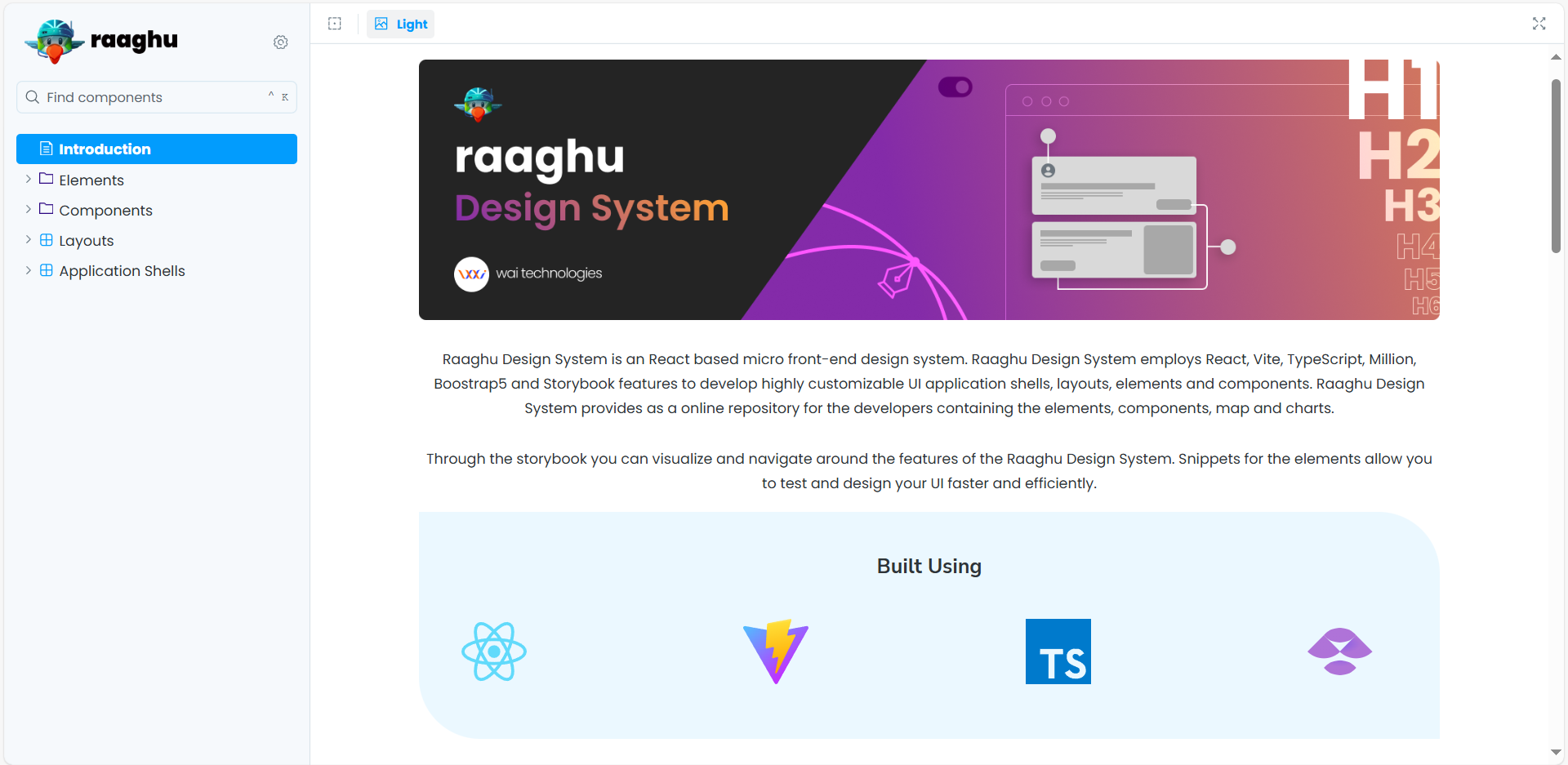
The Raaghu Design System is a comprehensive, scalable, and highly-documented React-based component library. It provides a unified set of UI components, design tokens, and theming capabilities for building consistent, accessible, and high-performance web applications.
Key Features
- Component Library: reusable, customizable React components (buttons, charts, pickers, toolbars, etc.) organized under
raaghu-componentsandraaghu-elements. - Design Tokens & Theming: Centralized SCSS variables and CSS custom properties for colors, spacing, typography, and many more. Supports easy theme switching (light, dark, etc.).
- Performance: Built-in performance monitoring, bundle analysis, and optimizations (tree-shaking, code splitting, memoization, virtualization).
- Accessibility: WCAG 2.1 AA compliance, keyboard navigation, ARIA support, color contrast, and focus management.
- Localization (i18n): Internationalization support for multiple languages, RTL, pluralization, and context-aware translations.
- Documentation: Extensive guides for architecture, CSS, theming, localization, performance, and testing.
- Automated Tooling: Scripts for generating SCSS, updating theme variables, and maintaining consistency.
Project Structure
- raaghu-components and raaghu-elements: Source code for all UI components.
- public: Static assets.
- utils: Utility functions and helpers.
- package.json, tsconfig.json, vite.config.ts: Project configuration files.
Development Workflow
- Components are developed in isolation, documented with Storybook, and tested for accessibility and performance.
- SCSS files use design tokens for all styling, ensuring consistency and easy theming.
- Automated scripts help maintain and extend the system efficiently.
Quick Start for Developers
- Read the architecture overview and CSS guides in the docs folder.
- Follow the component structure and naming conventions.
- Use design tokens and theme variables for all styling.
- Test for accessibility and performance as you build.